 Moto 360 Review
[box type=”shadow” align=”aligncenter” ]
Pros:
Stylish
Affordable
Wireless charging
Cons:
Poor battery life
Inefficient processor
Lacks default faces
[/box]
Motorola’s Moto 360 is a fine example of how a great design and a good price tag aren’t everything. What really matters is what is on the inside and Moto 360 is a bit of a disappointment when it comes to performance.
Interface
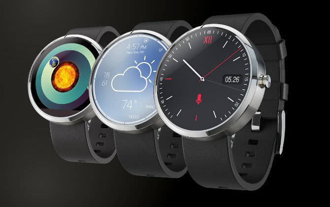
Moto 360 runs on Android 5.0 Lollipop, making it compatible with most Android Wear apps you can find on Google Play. The watch itself has a number of watch faces you can choose from, courtesy of Watch Face API, which is available for developers to play with.
The latest Moto 360 update makes everything about watch faces much easier, from browsing to downloading and changing them. The update now also allows the user to see how much each app is draining the battery. This latter is especially nice knowing that Moto 360 suffers from poor battery life issues, unlike the Pebble Steel.
Moto 360’s interface is picked up from Google Glass and Google Now, so you should feel used to it from the get-go. What is different is that the screen is circular for once.
You can take a quick look at the information cards by interacting with the Moto 360’s touchscreen. Most of it is designed to predict your query. This means the watch will remind you of any birthdays, flights and more that you have an interest in.
Display
The display is 1.56 inch, LCD, and it is a joy to look at it! Even on a power saving mode, it will still tell you the time thanks to the LCD back light.
What’s even more impressive about the display is that it’s made of Gorilla Glass 3 similar to the Pebble Steel, so it will take a lot of abuse to even scratch it.
The ability to adjust the screen brightness will come in very handy, especially if you want to preserve battery or you are bothered by the sun.
Unfortunately, Moto 360’s display drivers and ambient light sensor are positioned in a horizon line situated at the bottom of the watch face. However, this shouldn’t ruin the experience too much.
The resolution is a solid 320 x 290, with 205ppi. That’s not bad, but it isn’t great either. On a smaller display, this resolution would be fine, but on Moto 360’s it can look a bit pixelated at times.
Design
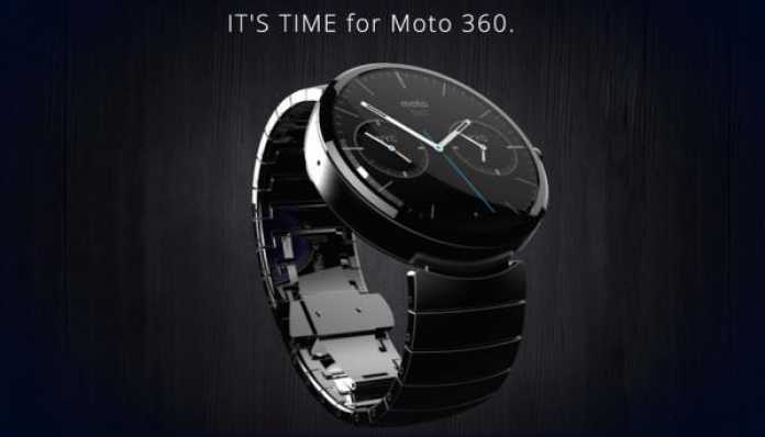
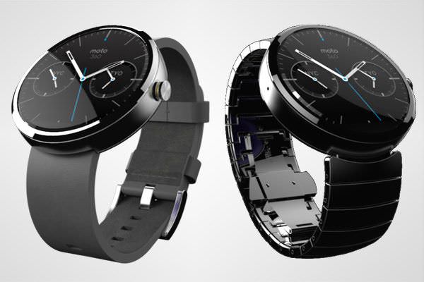
Okay, the design is clearly where Moto 360 shines the most and this TechWear is not all about the circular display. Compared to another round smart-watch, LG G Watch R, the Moto 360 looks very premium with its stainless steel bezel.
Add a real leather strap (made by the same company that makes NFL balls) and you will never think of hiding this device with sleeves. The strap also looks very durable and you won’t have to worry about it looking old after only a few weeks like with other smart-watches.
Right now, Moto 360 strap comes in three colors: black, gray and stone for leather and light and dark steel. However, since the watch originally comes with a leather strap, you’ll have to pay a bit extra if you want a metal one.
Apps
Unfortunately, as much as we were impressed by Moto 360’s design, we were a little put off by what’s inside. Or rather, the lack of what’s inside.
Right now, there are about 44 apps available via Android Wear. The Moto 360 is compatible with almost all of them.
Apart from the regular Google apps, like Maps, Moto 360 also has a few others as well. For example, if you want to organize your day or week, Wunderlist is a great choice. If you are looking for a tasty dish to impress someone, you can find it at All the Cooks. And, if you’re looking for a date, there’s Tinder.
One of my favorite apps here is Glympse. What this app does is that it sends your location to the contacts you select. All you have to do is say “Ok Google, start Glympse” and the app will send your GPS coordinates right away.
When it comes to fitness, this smart-watch is good enough, but not the best you’ll find in the market. It has a heart rate monitor and a step counter, which are presented in graphs, but you can’t see the data on either your smartphone or your tablet.
 Battery
With a 320mAH battery inside, Moto 360 will be able to run for about a day and a half. In fact, count yourself lucky if you make it that far. Most of the time, you will have to charge it at the end of the day, that’s pretty typical now though.
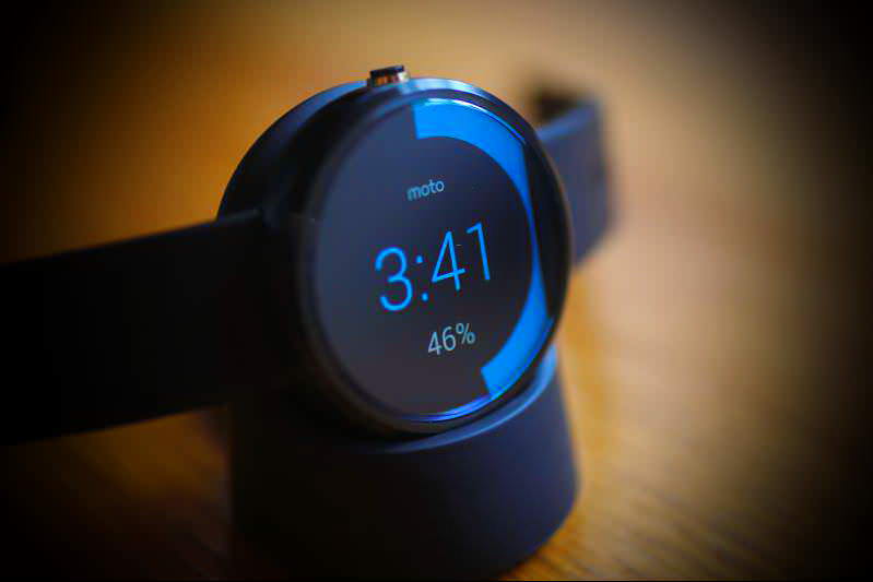
Fortunately, charging the Moto 360 is one of its stronger suits. Motorola has included a Qi charging dock, so you can just leave it on the table and it will act like a bedside clock.
While it’s charging, the Qi charging dock will dim the display, and will take about 2 hours before it is at 100%, then you’re ready to go.
Verdict
If it was all about the design, Moto 360 would be the best smart-watch ever made for a couple of years probably. The fact is, however, with underperforming specs, low screen resolution and a poor battery life, the Moto 360 would be hard pressed to justify a higher price tag. Check out Sony’ s Smart-watch


